

Are the Coronavirus Case Counts Useful?
“All models are wrong, but some models are useful. So the question you need to ask is not ‘Is the model true?’ (it never is) but ‘Is the model good enough for this particular application?’ ”
— George Box
The COVID-19 pandemic has inspired many of us to dig into the publicly available pandemic data; yet every time a new analysis is presented, someone inevitably asks: “But what about testing?” How can we extract any useful information out of the number of reported cases when the testing protocol is murky at best? Does our lack of information about testing render the data useless? To use or not to use the data, that is the question.
The answer to this conundrum is “it depends on what you want to learn from the data.” If you want to estimate the absolute number of coronavirus cases given the reported number of positive tests, you are likely to be stymied. We do not know the total number of cases; moreover, we do not know of any way to get a reasonable estimate of the absolute number of cases with the information we currently have; (Iceland may be an exception to this since they appear to have implemented something close to 5% randomized testing across their population). But there are potentially useful analyses that can be done that do not require absolute numbers and instead rely on rates. That is, we can ask how fast is the virus spreading versus how many cases are out there.
The fundamental issues underlying the testing question were beautifully articulated in a recent FiveThirtyEight article entitled: “Coronavirus Case Counts Are Meaningless* *Unless you know something about testing. And even then it gets complicated”. The article provides an excellent discussion of what can go wrong when using the number of reported cases as a proxy for the actual number of cases, and illustrates particular pitfalls using simulated data derived from different testing protocols. In the following scenarios, we will shamelessly borrow FiveThirtyEight’s idea (imitation is the purest form of flattery!) but we will: (a) skip the SIR model and instead select two functions to represent the actual number of cases in two idealized populations and (b) focus on the impact of testing protocols on measured fractional growth rates for a given distribution of cases.
Exploring different idealized testing protocols
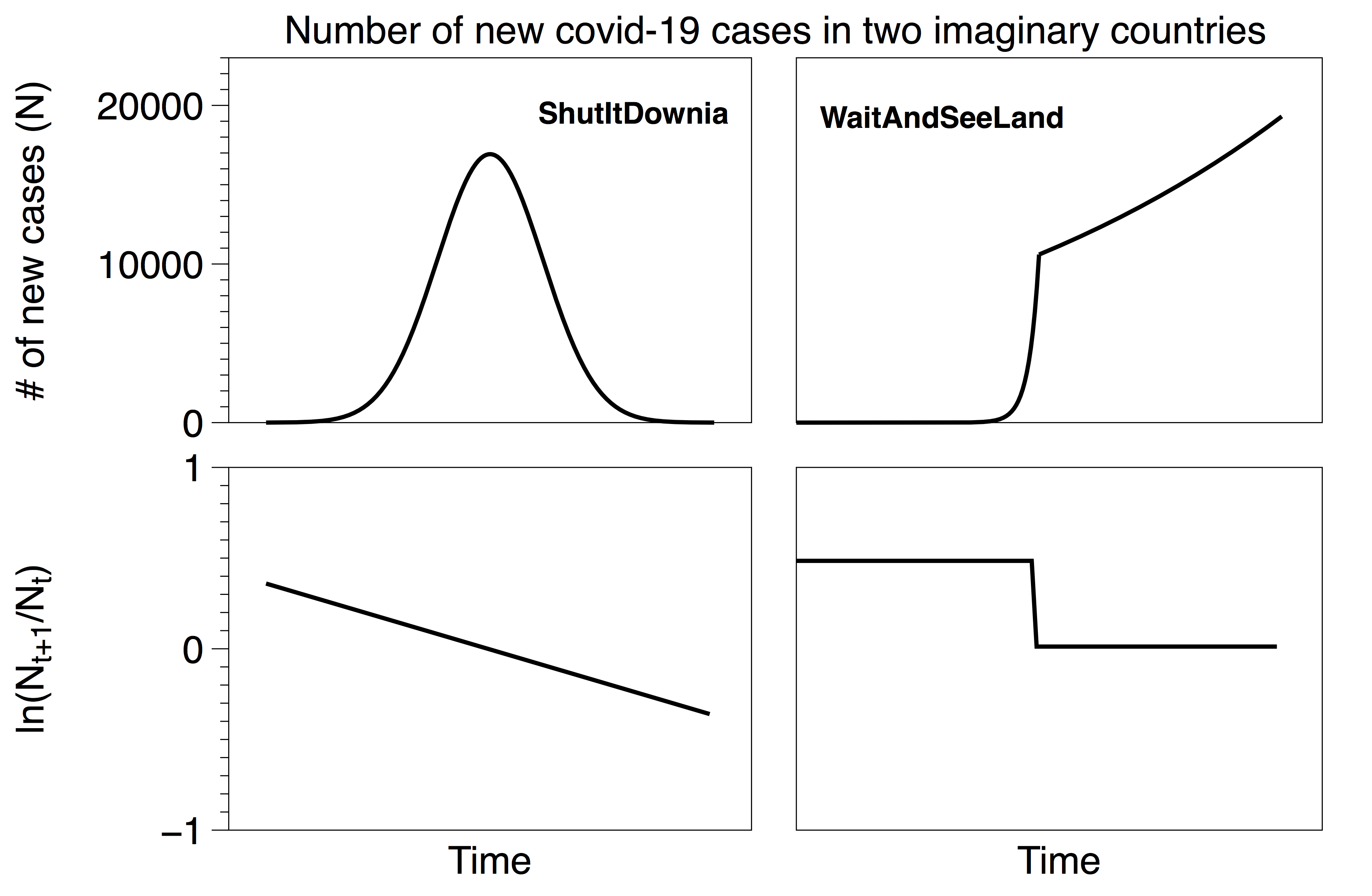
Consider two imaginary countries, ShutItDownia and WaitAndSeeLand. ShutItDownia quickly implemented stringent policies at the first hint of the pandemic and rapidly brought the spread of the disease under control (left). WaitAndSeeLand waited to react and their growth curve is exponential followed by an exponential with a slower time constant e.g. after implementing weak social distancing policies (right). The lines in the top plots represent the actual total number of cases in each country (which are unknown). The lines in the bottom plots represent the fractional growth rates of the top curves. These rates are also unknown, and we would like to estimate them from the testing data. Note that our functions are not meant to be exact replicas of actual countries; rather they will serve to illustrate the impact of testing decisions in the following four scenarios. Both imaginary countries have 100,000 residents.
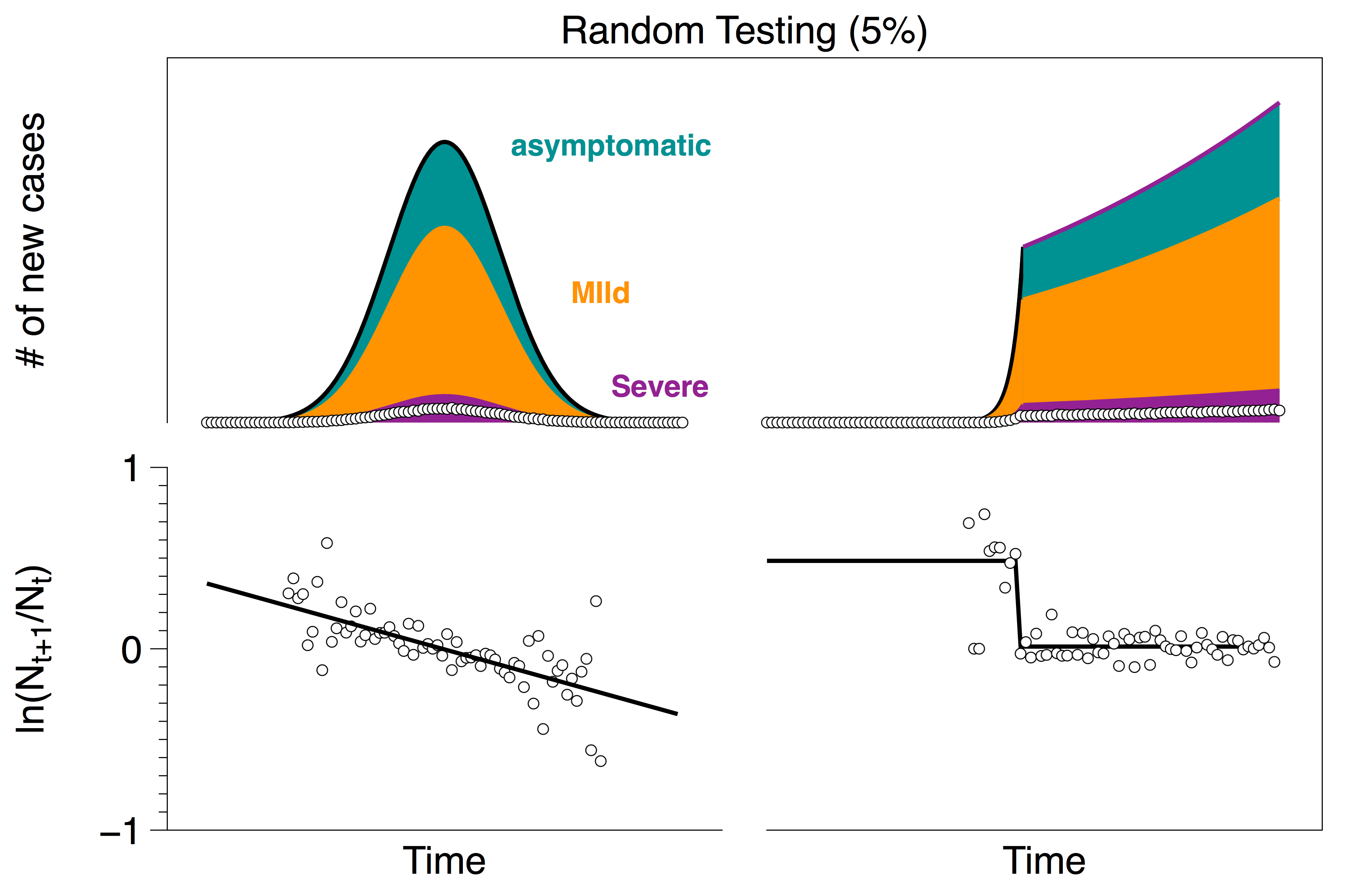
In all four scenarios below, we assume that a fixed fraction of cases are asymptomatic (30%), mild (60%), or severe (10%). These are the same proportions used in the FiveThirtyEight model (although we will find that our conclusions are not sensitive to the choice of these numbers).
Scenario 1: The gold standard, widespread randomized testing (Iceland)
In scenario 1, both countries adopt randomized testing across their entire population. Results from randomly sampling 5% of the population are shown in the figure below. White circles indicate the number of positive tests (top plot) and the measured fractional growth rate (bottom plot). As above, black lines indicate the actual number of cases (top) and the actual rates (bottom) which we would like to infer from the data points. (As expected, randomized testing across the entire population appears to provide a reasonable estimate of that growth rate.)
Scenario 2: Extremely limited testing capacity (US)
Next we will consider the extreme opposite of the Iceland limit, namely the case in which testing resources are extremely limited. In the US, testing criteria varies from state to state but there are a number of common themes that appear in the reporting:
- CDC Guidelines March 24: “Clinicians should use their judgment to determine if a patient has signs and symptoms compatible with COVID-19 and whether the patient should be tested. … Clinicians are strongly encouraged to test for other causes of respiratory illness.”
The CDC lists their top priorities for testing as: Hospitalized patients and symptomatic healthcare workers.
- The Atlantic March 13: Under the most widely used criteria, only people who have either traveled recently or have had known contact with a laboratory-confirmed COVID-19 patient can get tested, even if they have all the symptoms of the disease. This means that a city or region’s first community case may not qualify for a test, especially if the person is not sick enough to be hospitalized.
- CNN March 23: [Who will be tested] Anyone who has symptoms and has been in close contact with someone who has had a positive coronavirus test; anyone who has symptoms of coronavirus and needs to be hospitalized.
A recurring motif among all of these reports is that people who are sick enough to go to the hospital with corona-like symptoms are likely to be tested, while others are much less likely to get a test. Perhaps the simplest way to capture this is to assume that some fraction of the severe cases go to the hospital and are tested; the rest of the population is by-and-large untested. The plots below show this testing protocol in which severe patients have a 70% probability of going to the hospital and getting tested.
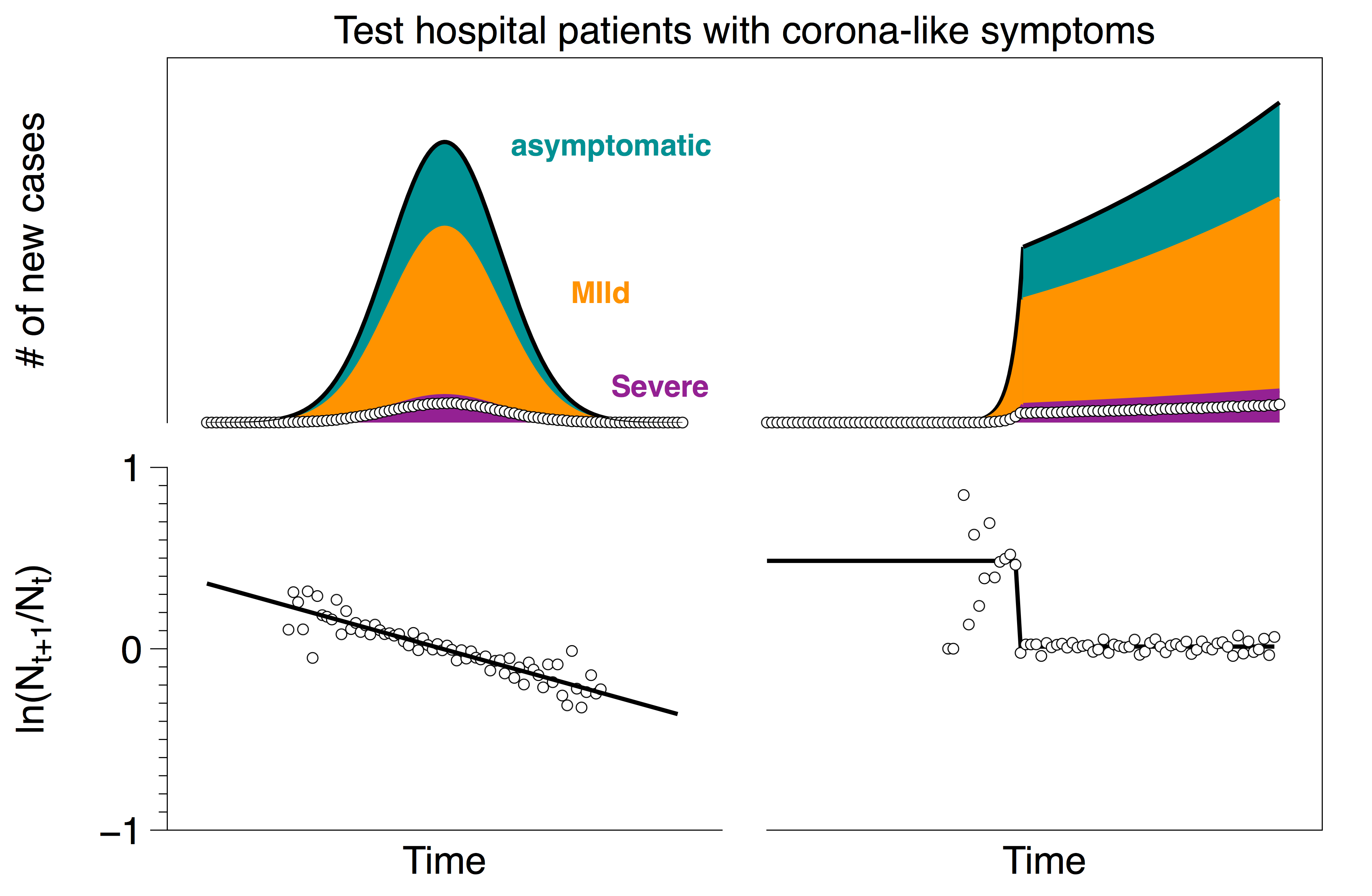
It is not terribly surprising that this limit also captures the rates reasonably well. Suppose that the number of people who go to the hospital with corona-like symptoms is H. Out of these patients, some have the coronavirus NC (note that these are only the people who go to the hospital, not the total number of people with the virus) and some do not NNC . Hence
H = NC + NNC
In this scenario, the number of tests is equal to the number of people who go to the hospital with corona-like symptoms: H = NT . Furthermore, the fraction of people with the coronavirus whose symptoms are severe enough to go to the hospital is proportional to the total number of people who have the virus: N = aNC . Putting this all together and solving for N (the actual number of cases) yields:
N = (NT – NNC)/a = (number of positive test cases)/a
Since the total number of actual cases is proportional to the number of positive test cases, we again expect the fractional growth rate of the recorded cases to be reflective of the actual fractional growth rate.
Scenario 3: Extremely limited testing capacity and people avoid the hospital as the healthcare system saturates
On April 6, the NYTimes reported:
- “NYTimes April 6: In an informal Twitter poll by @angioplastyorg, an online community of cardiologists, almost half of the respondents reported that they are seeing a 40 percent to 60 percent reduction in admissions for heart attacks; about 20 percent reported more than a 60 percent reduction.”
It is possible that some number of people who need urgent care are not getting to the hospital as the epidemic progresses (either because hospitals are overloaded, or people do not want to expose themselves to the virus, etc). Below we show the results from a testing protocol where initially there is a 70% probability that each severe case goes to the hospital, but that probability drops linearly to 35%.
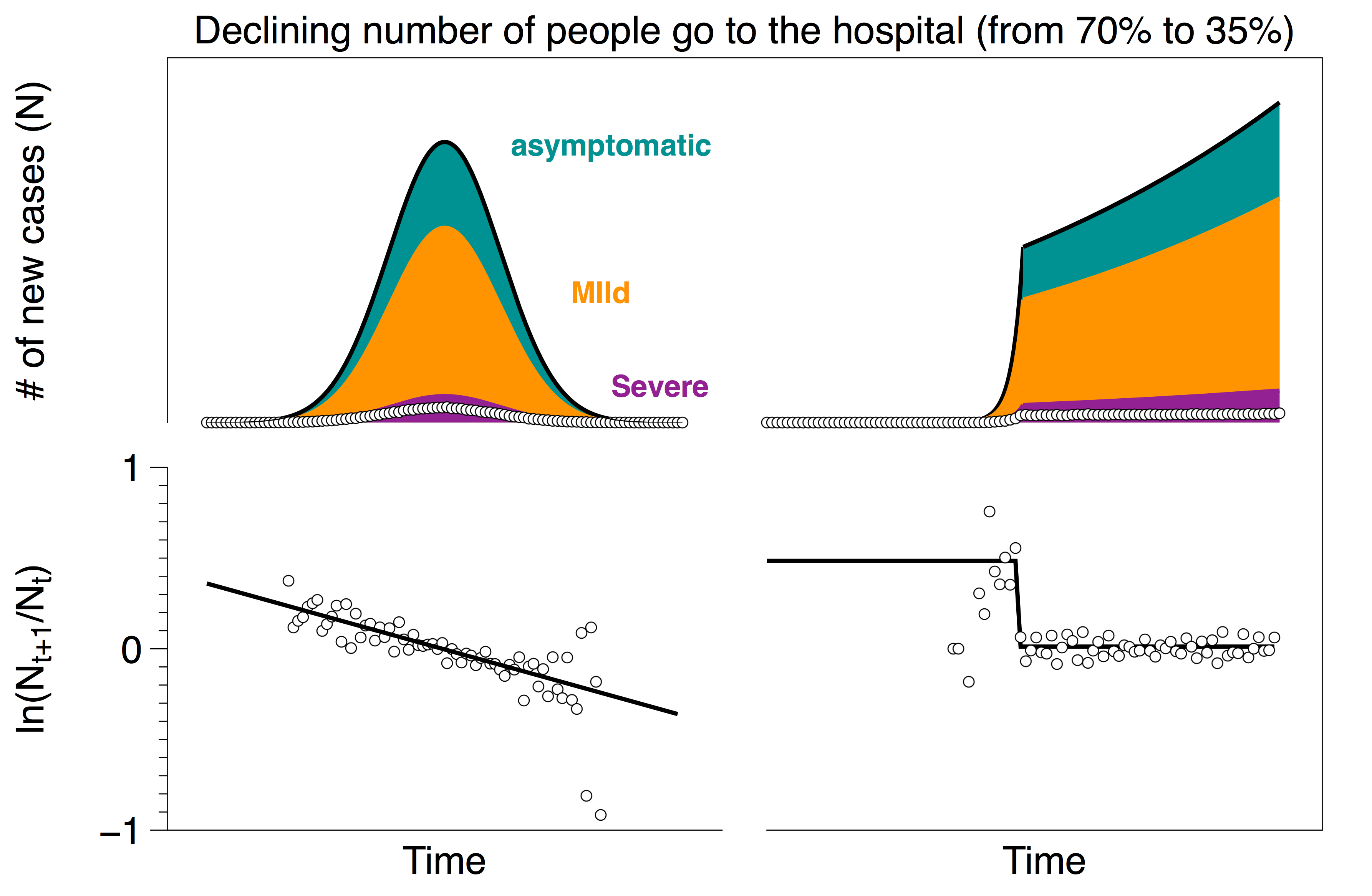
Even with a 50% decrease in hospital visits, the change in the rates is in the noise since the change in testing rates is swamped by the exponential change in the number of cases.
Scenario 4: Improving testing; ramp up from scenario 2 (extremely limited testing) to scenario 1 (wide-spread random testing).
There is little doubt that widespread reliable testing will be helpful in developing policies to mitigate risk as we bring the world back to work. One way (but certainly not the only way) to implement this in the US might look something like going from a situation similar to scenario 2 to a situation similar to scenario 1. This evolving protocol is shown in the plot below with a short ramp-up time. (Again, as in scenario 3, if the ramp-up is gradual, the change in the rates is lost in the noise).
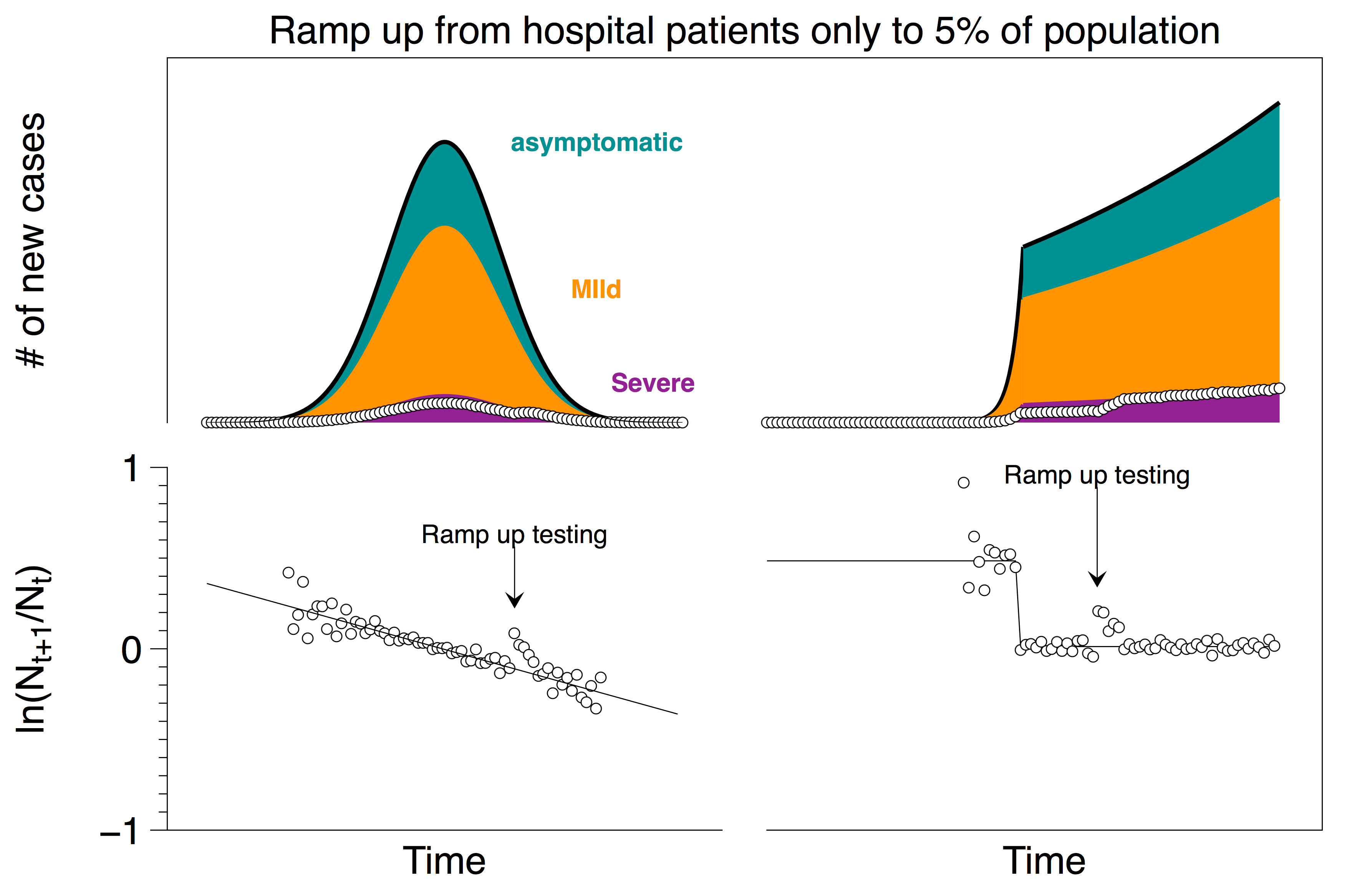
In this case of going from one extreme to the other, one may see a short-lived spike if the change is particularly abrupt; (but in reality, the real data tends to be noisier than the data from our two idealized countries so even that spike may be lost in the noise).
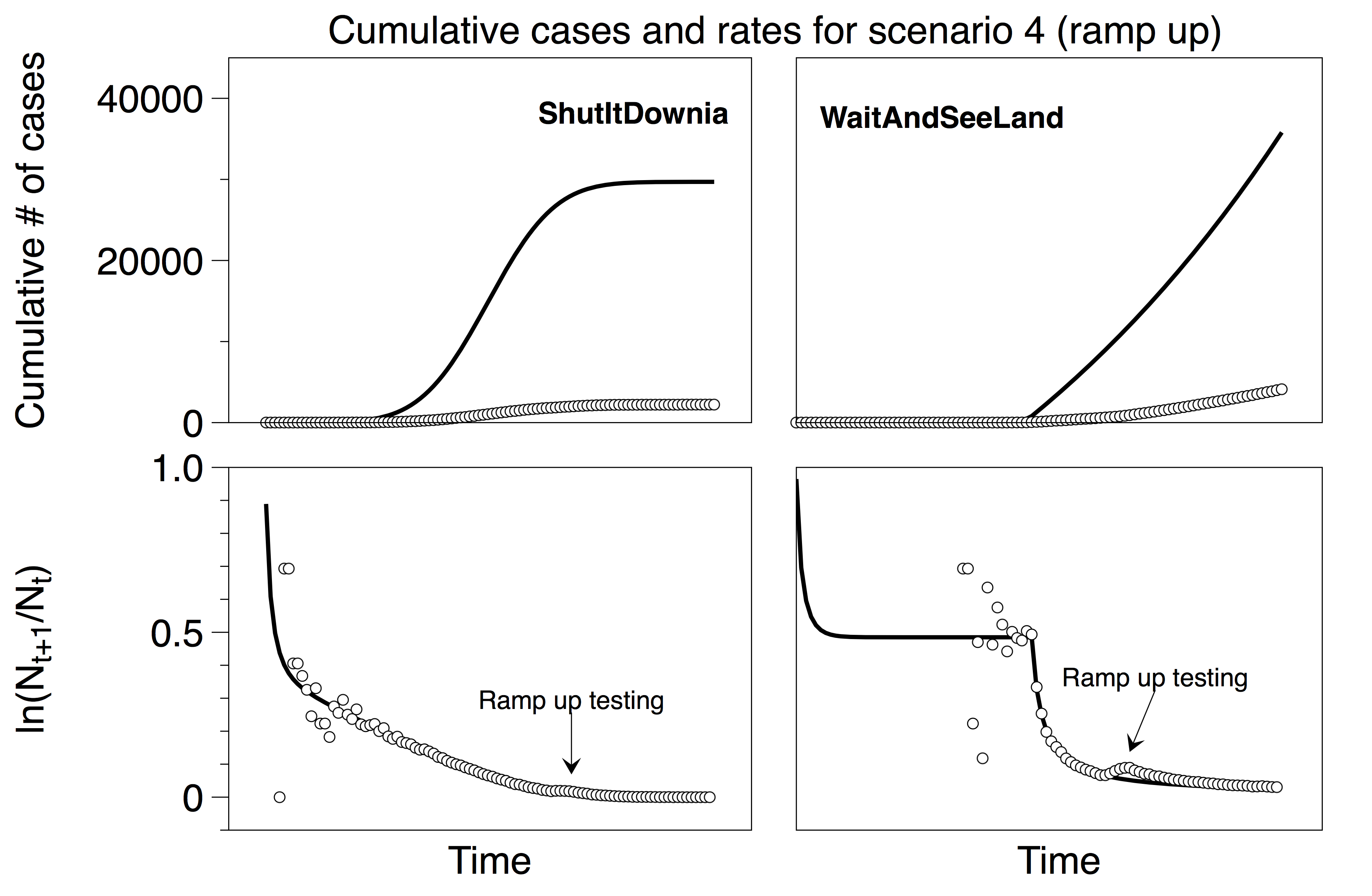
Finally, we note that typically the numbers reported in the databases are the cumulative number of cases rather than new cases. Transforming the scenarios above to cumulative numbers is a straightforward exercise that does not dramatically impact the key takeaways from the plots above. (In the four scenarios, we chose to show new cases rather than cumulative because the effect of changing protocol is more evident in the visualizations; as a point of comparison we show the equivalent graph for scenario 4 using cumulative numbers below.)
Evidence for different scenarios in the US Coronavirus data
There is some data available on how testing is happening across US states, in particular, how the testing capacity has ramped up over the last month or so. Ideally, we would like to use this data to provide some guidance on when the growth rate in the reported number of cases is reflective of the actual growth rates. (Or, if this is not possible, to at least rule out testing scenarios that are incompatible with the data.)
About the data
We will analyze data from the Covid Tracking Project that reports: (1) state-wide total tests, positive tests, negative tests and pending tests and (2) a reliability grade (A through B) on the data reported by the source. A number score is tallied based on four simple components:
- +1 for reporting positives reliably
- +1 for reporting negatives sometimes
- +1 for reporting negatives reliably
- +1 for reporting all commercial tests
The total score for each state corresponds to a letter grade: A-4, B-3, C-2, D-1.
As of today, 36 out of 51 states (plus DC) have a reliability grade of A, 14 have a reliability grade of B and 1 state (Washington) has a reliability of C. All states except for Washington report positives reliably, which is why Washington gets a C grade. Naturally, this data has been collected through the filtration of testing availability and protocol changes that happened in various states in the US.
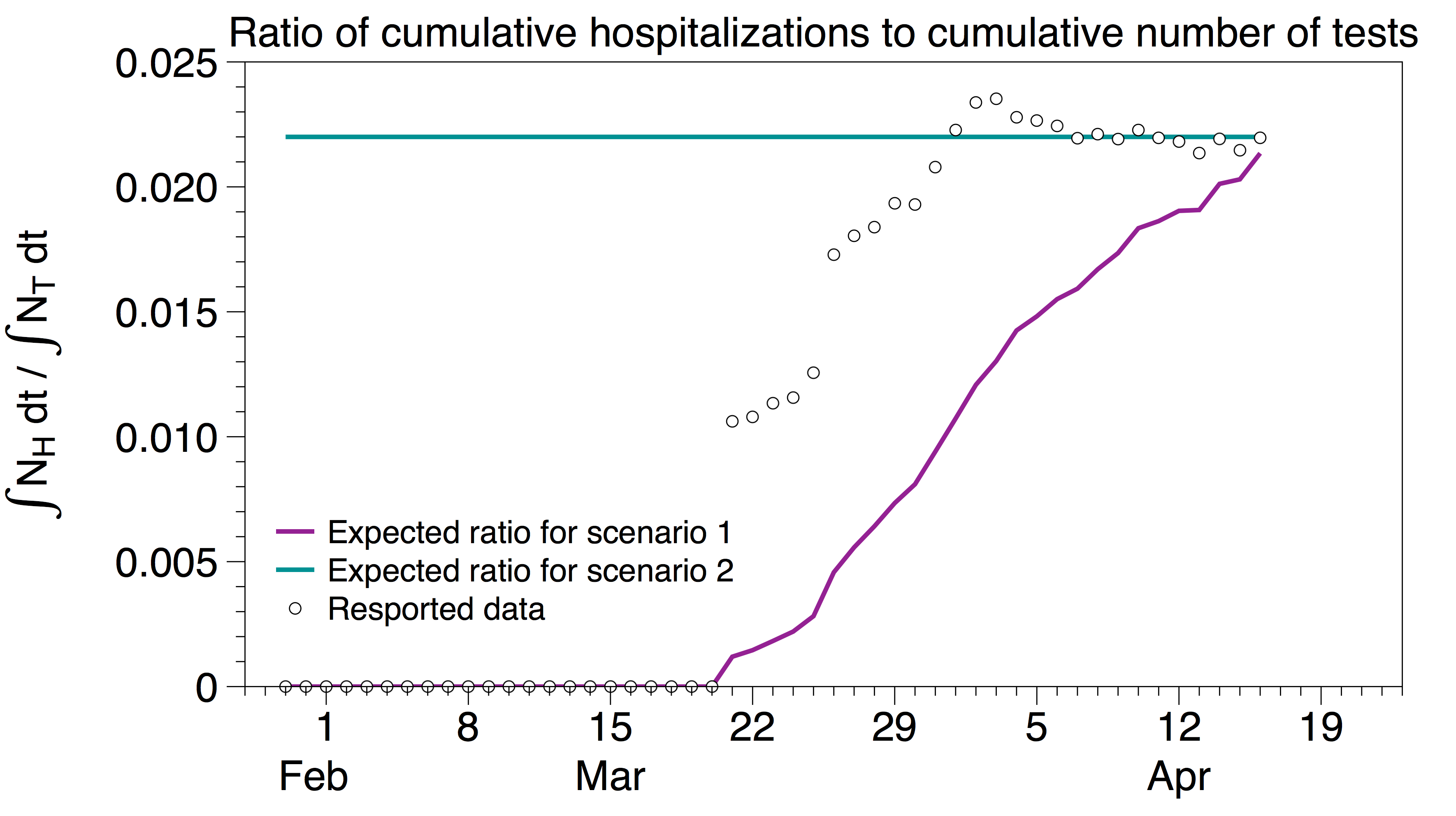
Are we in scenario 2 in the US?
In scenario 2, testing is prioritized to people with sufficiently severe corona-like symptoms who go to the hospital. In this scenario, the number of tests is proportional to the total number of people who go to the hospital to be tested, which we, in turn, estimate to be proportional to the number of hospitalizations NH. Hence we expect the cumulative number of tests to be proportional to the cumulative number of hospitalizations, i.e.
∫NH dt / ∫NT dt = const (for scenario 2)
In contrast, if we are in scenario 1, the total number of daily tests is constant so we expect
∫NH dt / ∫NT dt = ∫NH dt / (NTt) (for scenario 1)
In the plot below, we show ∫NH dt / (NTt) in purple and a constant line in teal. The circles represent ∫NH dt / ∫NT dt, i.e. the measured ratio of the cumulative number of hospitalizations in the US to the cumulative number of tests in the US using data from the Covid Tracking Project. After an initial transient, these data seem to be consistent with scenario 2 (although there are certainly other testing protocols which may also fit the data), and suggest that one can rule out scenario 1 for the US data.
What about other scenarios?
There are many other testing scenarios one could imagine; in particular, the FiveThirtyEight article points out a few that should make us wary. Can we use the testing data to rule out any of the FiveThirtyEight scenarios? The plot below shows daily aggregate testing data in the US over all the states and territories (blue), as well as data restricted to those with a grade of ‘A’ (orange). The first observation is that, through much of April, testing has flattened at roughly 150,000 tests per day. Since we do not see a decrease in testing, we posit that we can rule out FiveThirtyEight’s scenario 4 (let’s call it scenario 4-538 for short) of a potentially politically motivated, decrease in testing.
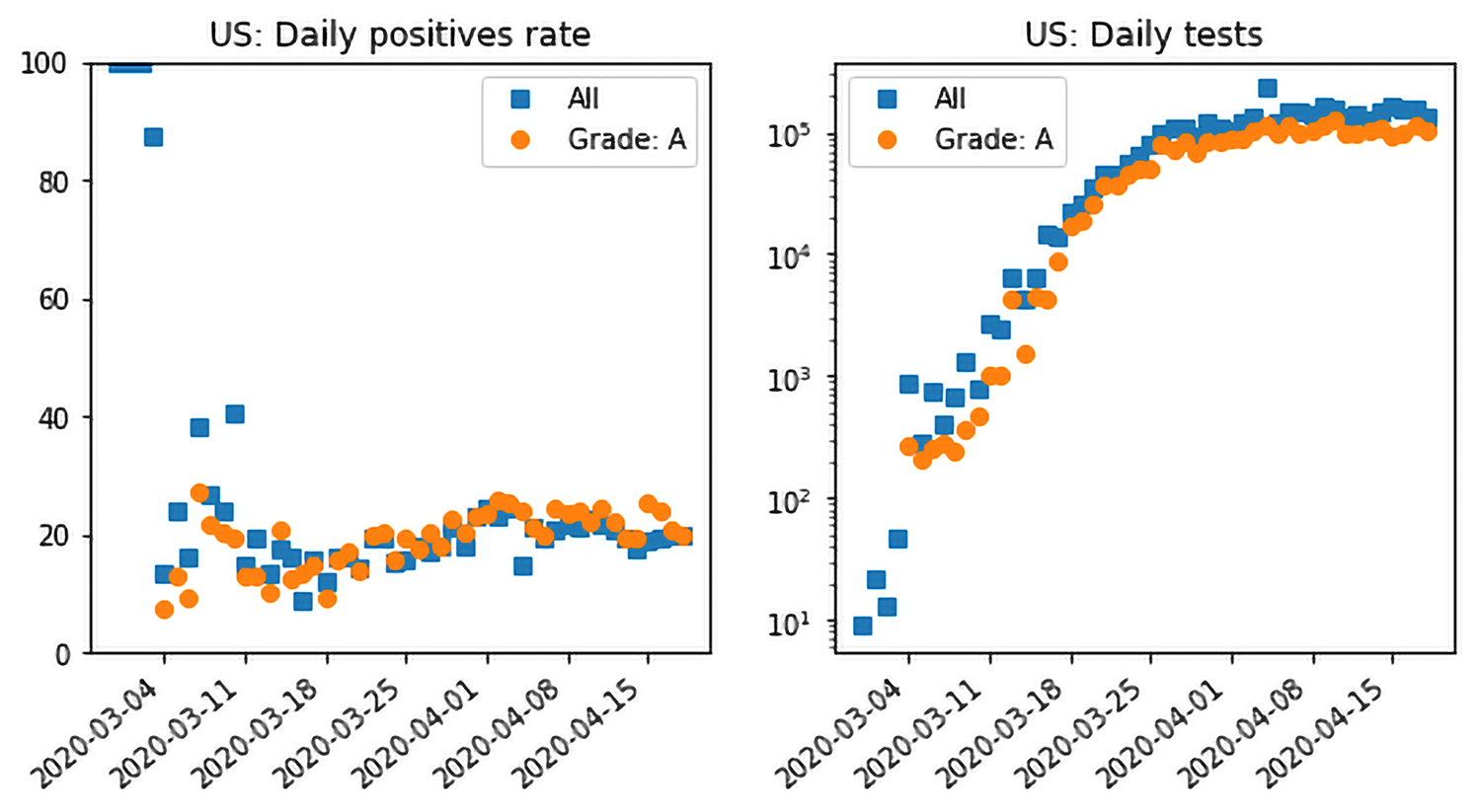
However, this still leaves us with the undesirable features of scenarios 2-538 and 3-538, namely a low ceiling of tests incapable of capturing the full scope of the epidemic. This is where the plot on the left showing the positive testing rate is also useful. The rate has been flat at about 20% since mid-March. The actual rate in each state is different: about 40-50% in hard-hit states like New York and New Jersey; Texas, Ohio and Florida at about 10%, with sparser states like Oregon and Maine at about 5%. We also show the corresponding plots for New York, New Jersey and Florida for comparison. They all have a data grade of A.
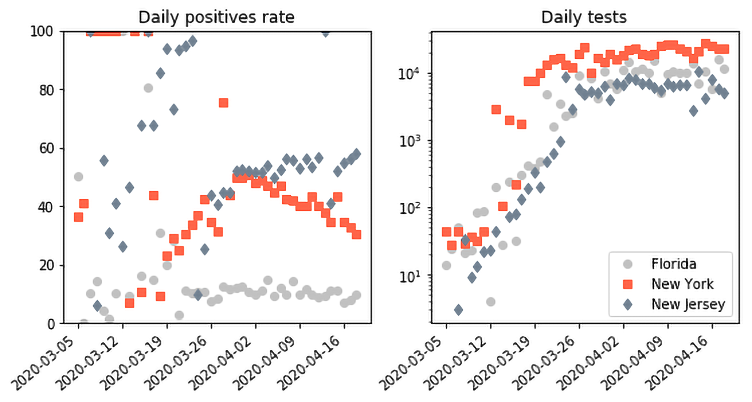
In the setting of a test ceiling, prioritizing tests to severe cases as suggested by the CDC actually helps us reason about the testing ceiling. Suppose that the epidemic was indeed growing beyond the current testing capability and the tests were prioritized to mostly severe cases. We would expect, in that setting, that the positive testing rate would grow and, in fact, saturate at about 100% (or the power, i.e. 100% minus the False Negative Rate of the test). This is not what we see in the US data as a whole. In the past 7 days, New Jersey has had the highest average positive testing rate at about 55%, which is a far cry from the saturation we might expect from an insufficient testing ceiling. Interestingly, we see clear evidence of the prioritization happening in the early US and state data, e.g. from the first week of March. The testing capacity was quite low at the time and the positive testing rate was 100%: every subject tested at the time was positive for COVID-19.
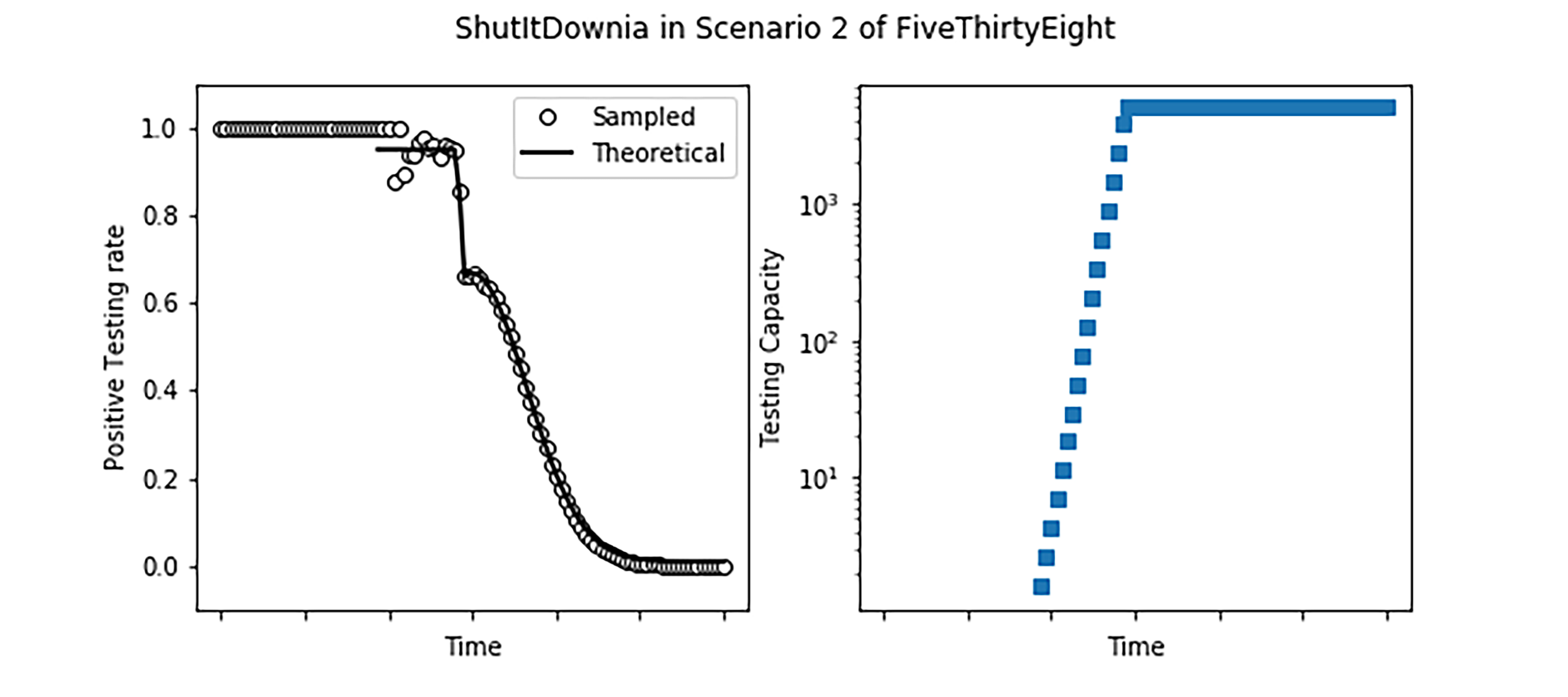
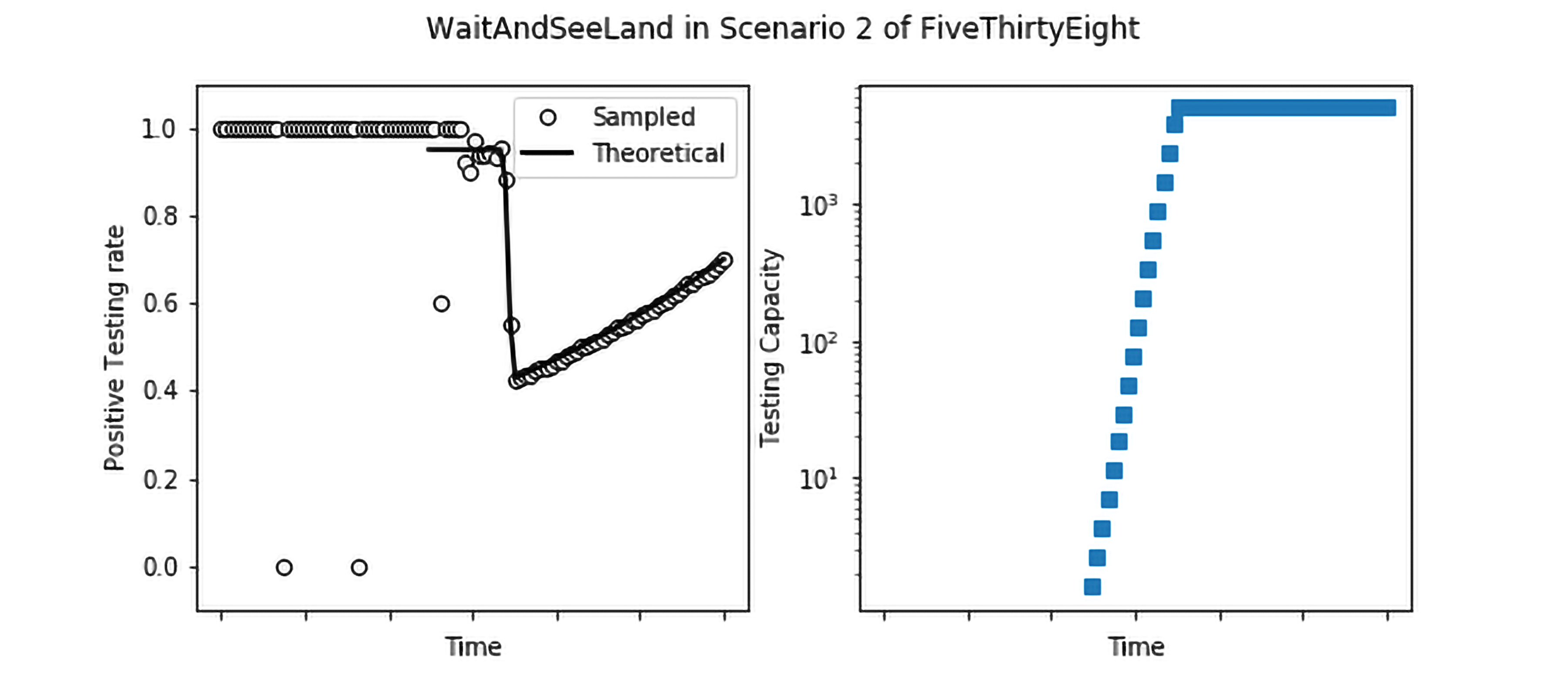
Finally, it is instructive to compare this case with simulations of what would happen in ShutItDownia and WaitAndSeeLand. We use the same epidemic parameters as before and suppose that we are in Scenario 2-538, where the testing capacity rapidly grows but flattens out at a number that is small in comparison to the size of the epidemic. We also assume a prioritization as follows: 70% of all severe cases are hospitalized, and immediately tested; if there is remaining capacity left over, mild cases are tested with a cap on 40% of mild cases being tested. Finally, if there is capacity left over from testing severe and mild cases, testing is expended on the uninfected population.
In ShutItDownia, we see that the positive testing rate is essentially 100% initially, until the testing capacity grows to catch up to the epidemic, at which point it accurately detects the decrease in the size of the epidemic. In WaitAndSeeLand as well, initially the testing capacity is swamped leading to a positive testing rate of nearly 100%. However, once the testing capacity grows, the daily positive testing rate captures the rate of growth of the epidemic. New York State data, though noisier, shows both of these features: after the testing capacity is no longer completely swamped, the daily positive testing rate captures the growth of the epidemic, peaking at about 55%, before reducing steadily (albeit not as rapidly as ShutItDownia).
In a nutshell:
- Our analysis suggests that it is not unreasonable to use the COVID-19 data to estimate spreading rates (as opposed to absolute numbers) in the US;
- Changes in the testing protocol are often eclipsed when the number of cases is changing exponentially (i.e. the rate estimates are likely to remain reasonable under those conditions);
- There are signatures of the testing protocols hidden in the testing numbers, some of which can be teased out in combination with other data (e.g. hospitalization rates).
For further details, please contact: Yash Deshpande, Peko Hosoi, Emma Tegling

